Summary: Which is the most critical element in data exploration, statistics or data visualization? The answer is a little like the lyric ‘love and marriage, you can’t have one without the other’. It can be tempting to skip the data visualization but it’s frequently the key to making sure we aren’t heading down the completely wrong path.
 How much trouble can you get into with statistics? A lot. That old catch phrase has been applied to our broader society for a long time but even a data scientist can run afoul of this maxim.
I admit, when talking about data visualization, I’m usually thinking about telling the story of the data and the analysis to my non-data scientist clients. It’s easy to forget that doing predictive modeling without data viz is a dangerous path.
For an example, take a look at these four short data sets and see if you can spot the differences and similarities. There are only 11 observations, one variable, and one outcome in each set.
|
I |
|
II |
|
III |
|
IV |
||||
|
x |
y |
x |
y |
x |
y |
x |
y |
|||
|
10.0 |
8.04 |
10.0 |
9.14 |
10.0 |
7.46 |
8.0 |
6.58 |
|||
|
8.0 |
6.95 |
8.0 |
8.14 |
8.0 |
6.77 |
8.0 |
5.76 |
|||
|
13.0 |
7.58 |
13.0 |
8.74 |
13.0 |
12.74 |
8.0 |
7.71 |
|||
|
9.0 |
8.81 |
9.0 |
8.77 |
9.0 |
7.11 |
8.0 |
8.84 |
|||
|
11.0 |
8.33 |
11.0 |
9.26 |
11.0 |
7.81 |
8.0 |
8.47 |
|||
|
14.0 |
9.96 |
14.0 |
8.10 |
14.0 |
8.84 |
8.0 |
7.04 |
|||
|
6.0 |
7.24 |
6.0 |
6.13 |
6.0 |
6.08 |
8.0 |
5.25 |
|||
|
4.0 |
4.26 |
4.0 |
3.10 |
4.0 |
5.39 |
19.0 |
12.50 |
|||
|
12.0 |
10.84 |
12.0 |
9.13 |
12.0 |
8.15 |
8.0 |
5.56 |
|||
|
7.0 |
4.82 |
7.0 |
7.26 |
7.0 |
6.42 |
8.0 |
7.91 |
|||
|
5.0 |
5.68 |
5.0 |
4.74 |
5.0 |
5.73 |
8.0 |
6.89 |
|||
Naturally the first thing we’re likely to do is apply some descriptive statistics to see how these four examples are similar or different. Here’s the same dataset with the common statistics.
|
|
I |
|
II |
|
III |
|
IV |
||||
|
x |
y |
x |
y |
x |
y |
x |
y |
||||
|
10.0 |
8.04 |
10.0 |
9.14 |
10.0 |
7.46 |
8.0 |
6.58 |
||||
|
8.0 |
6.95 |
8.0 |
8.14 |
8.0 |
6.77 |
8.0 |
5.76 |
||||
|
13.0 |
7.58 |
13.0 |
8.74 |
13.0 |
12.74 |
8.0 |
7.71 |
||||
|
9.0 |
8.81 |
9.0 |
8.77 |
9.0 |
7.11 |
8.0 |
8.84 |
||||
|
11.0 |
8.33 |
11.0 |
9.26 |
11.0 |
7.81 |
8.0 |
8.47 |
||||
|
14.0 |
9.96 |
14.0 |
8.10 |
14.0 |
8.84 |
8.0 |
7.04 |
||||
|
6.0 |
7.24 |
6.0 |
6.13 |
6.0 |
6.08 |
8.0 |
5.25 |
||||
|
4.0 |
4.26 |
4.0 |
3.10 |
4.0 |
5.39 |
19.0 |
12.50 |
||||
|
12.0 |
10.84 |
12.0 |
9.13 |
12.0 |
8.15 |
8.0 |
5.56 |
||||
|
7.0 |
4.82 |
7.0 |
7.26 |
7.0 |
6.42 |
8.0 |
7.91 |
||||
|
5.0 |
5.68 |
5.0 |
4.74 |
5.0 |
5.73 |
8.0 |
6.89 |
||||
|
Average |
9.0 |
7.5 |
|
9.0 |
7.5 |
|
9.0 |
7.5 |
|
9.0 |
7.5 |
|
Variance |
11 |
4.12 |
|
11 |
4.12 |
|
11 |
4.12 |
|
11 |
4.12 |
|
Correlation |
|
0.816 |
|
|
0.816 |
|
|
0.816 |
|
|
0.816 |
|
Linear Regression Line |
y = 0.5x + 3 |
|
y = 0.5x + 3 |
|
y = 0.5x + 3 |
|
y = 0.5x + 3 |
||||
That’s right, they are all statistically identical. All four have a mean ‘x’ value of 9.0 and a mean ‘y’ value of 7.5. In all four cases the variance for ’x’ is 11 and the variance for ‘y’ is 4.12. The correlation between ‘x’ and ‘y’ is 0.816 for each dataset, and a linear regression (line of best fit) for each dataset follows the equation ”y = 0.5x + 3”.
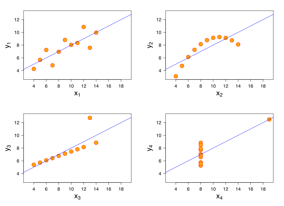
So far these four datasets appear to be pretty similar. But when we plot these four data sets we get these results:

If you haven’t run into these datasets before, this is Ansombe’s Quartet (the data and images are from Wikipedia). They were developed in 1973 by Francis Anscombe, a statistician, to illustrate the importance of visualizing data as part of our exploratory data discovery. Jock Mackinlay, Vice President of Visual Analysis Research & Design at Tableau turned me on to this famous example, and it’s so powerful we should all review this from time to time.
Let’s look at what happened. First, our objective is to draw a line that is an accurate, unbiased predictor of y given x. The Sum of Squared Errors (SSE) from the linear regression line is a fairly impressive .816.
But the limitations on linear regression are what we have to remember: 1.) the trend should be linear, 2.) there should be no distorting outliers, and 3.) the residuals are normally distributed. I know, this is like the fine print in the operating instructions, but it’s why it’s not working here.
Set 1: This is a regular linear relationship for which regression can work and for which SSE is meaningful.
Set 2: This is clearly not a linear relationship, probably closer to a parabolic curve. SSE is useless.
Set 3: The outlier kills this one. That was also what Anscombe set out to demonstrate.
Set 4: Worse than Set 3, an outlier can fool us into believing there’s a linear correlation when a quick glance at the data shows this isn’t true.
So our first takeaway should be that summary statistics don’t tell you everything you need to know about your data. Don’t proceed until you’ve plotted the data and examined it. Data exploration is a serious first step.
However, and this is a big however, don’t fall into the trap of trying to cherry pick features based on the strongest visual correlations. This can get you into serious Type I errors. You need to conduct both hypothesis testing and visualization together.
It’s worth remembering that sometimes data vizualization trumps statistics. Like Yogi Berra said, “You can see a lot by looking”.
About the author: Bill Vorhies is Editorial Director for Data Science Central and has practiced as a data scientist and commercial predictive modeler since 2001. He can be reached at:
