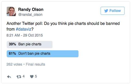
Oh, the poor, maligned pie chart. The chart type that gets pushed around and bullied on the data-viz playground more than any other. Randal Olsen of /r/dataisbeautiful ra...
Previous Relevant Posts Single regression with R to identify relationship between WTI and s… Getting stock volatility in R & Getting Histogram of returns What i...
Summary: What do you need to do to get an entry level job in data science? This article is written for anyone who is considering becoming a data scientist. That inclu...
Guest blog by Sebastian Raschka, originally posted here. If we tackle a supervised learning problem, my advice is to start with the simplest hypothesis space first. I....
Guest blog post by Martijn Theuwissen, co-founder at DataCamp. Other R resources can be found here, and R Source code for various problems can be found here. A data sc...
The use and value of torture or enhanced interrogation techniques on captured enemy combatant is a much debated topic in the US political and media circles. The arguments...
Summary: Will Automated Predictive Analytics be a boon to professional data scientists or a dangerous diversion allowing well-meaning, motivated but amateur users try t...
Originally posted on :Linkedin It’s a known fact that bagging (an ensemble technique) works well on unstable algorithms like decision trees, artificial neural netwo...
We just started in this article to provide answers to one of the largest collection of data science job interview questions ever published, and we will continue to add an...
Software Development and Data Science While on the job, data scientists are often required to perform a large set of tasks that they are taught how to do through their ed...