In ordinary linear regression, we are estimating the mean of some variable y, conditional on the values of independent variables X. As we proceed to fit the ordinary least square regression model on the data we make a key assumption about the random error term in the linear model. Our assumption is that the error term has a constant variance across the values of independent variable X.
- What happens when this assumption is no longer true ?
- Also instead of estimating the mean of our independent variable can we estimate the median or the 0.3th quantile or 0.8th quantile of our independent variable ?.
This is where Quantile Regression comes to our rescue.
Let us write some code to better understand this. Let us create some data and plot it.
import numpy as np import matplotlib.pyplot as plt ## Generate some data with constant variance /noise x = np.arange(100).reshape(100,1) intercept_ = 6 slope_ = 0.1 ## non constant error error_ = np.random.normal(size = (100,1), loc = 0.0, scale = 1) ## Regression equation y = intercept_ + slope_ * x + error_ plt.figure(1) plt.scatter(x, y) plt.xlabel("x") plt.ylabel("y") plt.title("Data with constant variance")
We have one independent variable x and a dependent variable y. Our noise, error_ is gaussian with unit variance.
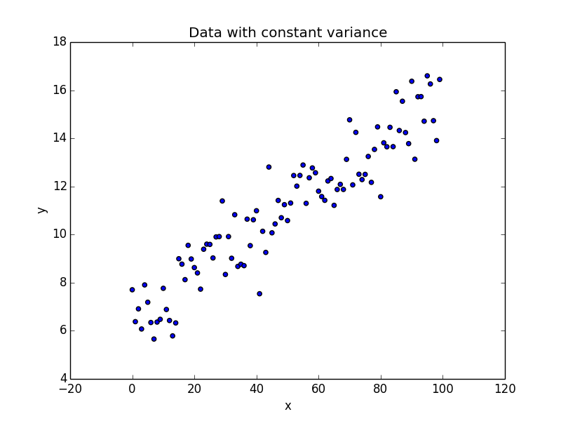
As seen in the plot, as we move from left to right along the x axis, we don’t see a lot of variation in the values of y. An ordinary least square regression is the ideal candidate here to model the data.
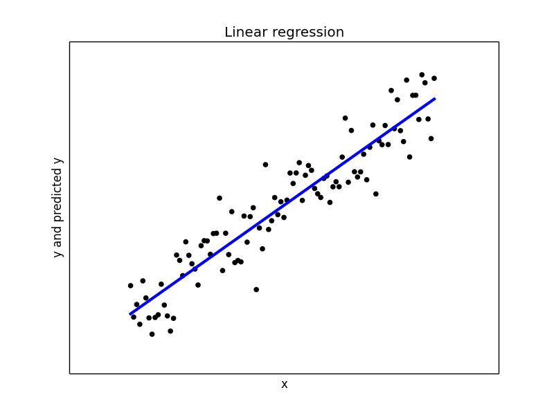
## Let us do a least square regression on the above dataset from sklearn.linear_model import LinearRegression model1 = LinearRegression(fit_intercept = True, normalize = False) model1.fit(x, y) y_pred1 = model1.predict(x) print("Mean squared error: {0:.2f}" .format(np.mean((y_pred1 - y) ** 2))) print('Variance score: {0:.2f}'.format(model1.score(x, y))) ## Plot the regression plt.figure(2) plt.scatter(x, y, color='black') plt.plot(x, y_pred1, color='blue', linewidth=3) plt.xticks(()) plt.yticks(()) plt.xlabel("x") plt.ylabel("y and predicted y") plt.title("Linear regression")
With a variance score of 1.0, we have modeled the data perfectly. Our plot of the regression line confirms the same.
Now let us introduce some variable noise in our data. Our noise varies based on the range of our x values.
## Generate some data with non-constant variance x_ = np.arange(100).reshape(100,1) intercept_ = 6 slope_ = 0.1 ## Non constant variance var_ = 0.1 + 0.05 * x_ ## non constant error error_ = np.random.normal(size = (100,1), loc = 0.0, scale = var_) ## Regression equation y_ = intercept_ + slope_ * x + error_ plt.figure(3) plt.scatter(x_, y_) plt.xlabel("x") plt.ylabel("y") plt.title("Data with non-constant variance")
scale parameter for our error_ calculation is no longer 1 as in the previous case. The scale is a linear function of our x value.
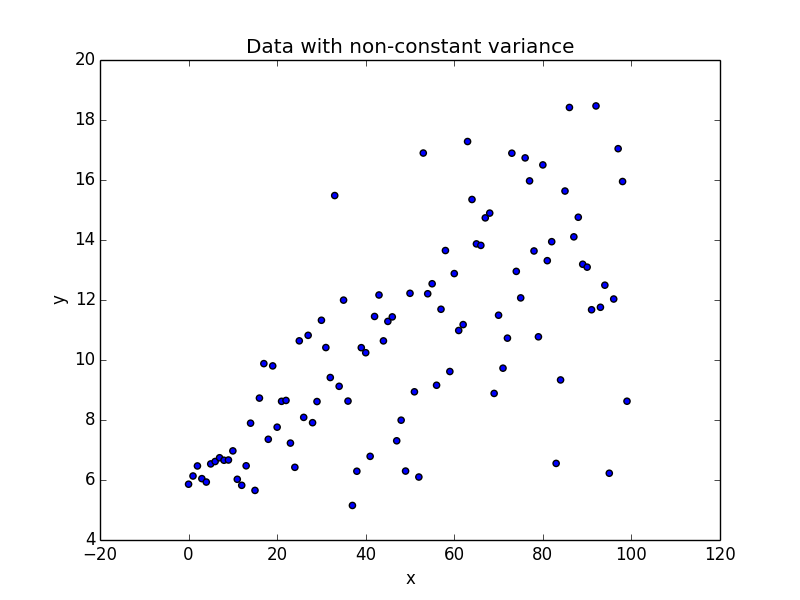
This phenomenon where the variability of y is unequal across the range of values of x is called as Heteroscedasticity. As seen in the plot it takes the shape of a cone. The y variable widens as the value of x increases. Let us try to fit a linear regression to this dataset.
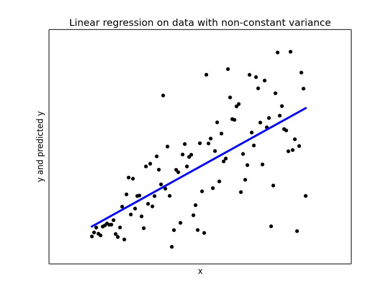
## Try to fit a linear regression model2 = LinearRegression(fit_intercept = True, normalize = False) model2.fit(x_, y_) y_pred2 = model2.predict(x_) print print("Mean squared error: {0:.2f}" .format(np.mean((y_pred2 - y_) ** 2))) print('Variance score: {0:.2f}'.format(model1.score(x_, y_))) ## Plot the regression plt.figure(4) plt.scatter(x_, y_, color='black') plt.plot(x_, y_pred2, color='blue', linewidth=3) plt.xticks(()) plt.yticks(()) plt.xlabel("x") plt.ylabel("y and predicted y") plt.title("Linear regression on data with non-constant variance")
With variance score of 0.43 linear regression did not do a good job overall. When the x values are close to 0, linear regression is giving a good estimate of y, but we near end of x values the predicted y is far way from the actual values and hence becomes completely meaningless.
Here is where Quantile Regression comes to rescue. I have used the python package statsmodels 0.8.0 for Quantile Regression.
Let us begin with finding the regression coefficients for the conditioned median, 0.5 quantile.
## Quantile regression for the median, 0.5th quantile import pandas as pd data = pd.DataFrame(data = np.hstack([x_, y_]), columns = ["x", "y"]) print data.head() import statsmodels.formula.api as smf mod = smf.quantreg('y ~ x', data) res = mod.fit(q=.5) print(res.summary())
First we take the data into a pandas dataframe so that its easier for us to work with statsmodel interfaces. Our dataframe data has two columns, ‘x’ and ‘y’.
We then proceed to build our Quantile Regression model for the median, 0.5th quantile. The summary of our model is
QuantReg Regression Results ============================================================================== Dep. Variable: y Pseudo R-squared: 0.3521 Model: QuantReg Bandwidth: 2.333 Method: Least Squares Sparsity: 6.136 Date: Wed, 07 Jun 2017 No. Observations: 100 Time: 12:41:29 Df Residuals: 98 Df Model: 1 ============================================================================== coef std err t P>|t| [0.025 0.975] ------------------------------------------------------------------------------ Intercept 6.0398 0.609 9.917 0.000 4.831 7.248 x 0.0934 0.011 8.791 0.000 0.072 0.115 ============================================================================== You see that our intercept is 6.0398 and our slope or the coefficient for our x is 0.0934. These are the parameters for the 0.5th quantile of our y. Similarly we can do the models for other quantiles.
## Build the model for other quantiles quantiles = np.arange(0.1,1,0.1) print quantiles models = [] params = [] for qt in quantiles: print qt res = mod.fit(q = qt ) models.append(res) params.append([qt, res.params['Intercept'], res.params['x']] + res.conf_int().ix['x'].tolist()) params = pd.DataFrame(data = params, columns = ['qt','intercept','x_coef','cf_lower_bound','cf_upper_bound']) print params
In side the for loop we build models for each quantile in our list quantiles. As we build these models we us also store the model parameters in a list called params. Late we make a dataframe of the same name, so we we can view our different models.
qt intercept x_coef cf_lower_bound cf_upper_bound 0 0.1 5.698090 0.029572 0.003315 0.055830 1 0.2 5.675552 0.064007 0.044955 0.083058 2 0.3 6.068472 0.064723 0.041046 0.088401 3 0.4 6.052980 0.080206 0.057767 0.102644 4 0.5 6.039761 0.093434 0.072342 0.114526 5 0.6 6.246257 0.099059 0.079956 0.118162 6 0.7 6.242220 0.112926 0.096575 0.129276 7 0.8 6.563459 0.122164 0.106023 0.138305 8 0.9 7.649235 0.119568 0.101328 0.137808 As you see in the above output, our intercept value for the 0.1th quantile is 5.698, slope is 0.0295 and we also have the lower and the upper bound aka the intervals of our x intercept value.
Let us plot 0.1th, 0.5th and 0.9th quantile models against our original data.
plt.figure(5) plt.scatter(x_, y_, color='black') plt.plot(x_, y_pred2, color='blue', linewidth=3, label='Lin Reg') y_pred3 = models[0].params['Intercept'] + models[0].params['x'] * x_ plt.plot(x_, y_pred3, color='red', linewidth=3, label='Q Reg : 0.1') y_pred4 = models[4].params['Intercept'] + models[4].params['x'] * x_ plt.plot(x_, y_pred4, color='green', linewidth=3, label='Q Reg : 0.5') y_pred5 = models[8].params['Intercept'] + models[8].params['x'] * x_ plt.plot(x_, y_pred5, color='cyan', linewidth=3, label='Q Reg : 0.9') plt.xticks(()) plt.yticks(()) plt.xlabel("x") plt.ylabel("y and predicted y") plt.title("Quantile regression on data with non-constant variance") plt.legend()
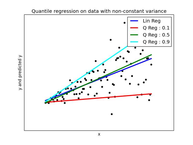
The Ordinary Linear regression model is plotted in blue colored line. You can compare that model with other quantile models.
Another interesting way to visualize is the slope values and their upper/lower bounds for different quantiles.
## Plot the changes in the quantile coefficients plt.figure(6) params.plot(x = 'qt', y = ['x_coef','cf_lower_bound', 'cf_upper_bound'], title = 'Slope for different quantiles', kind ='line', style = ['b-','r--','g--'])
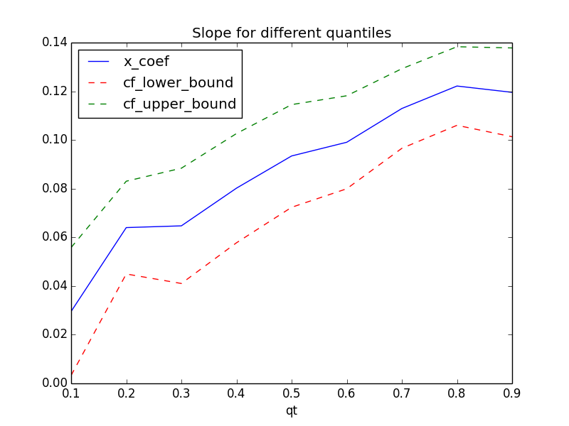
You can see how the slope value is varying for different quantiles. Compared with ordinary least square regression which is flat across all the quantiles, Quantile Regression allows us to investigate into the different areas of the data and model them appropriately.
References
-
Koenker, Roger and Kevin F. Hallock. “Quantile Regression”. Journal of Economic Perspectives, Volume 15, Number 4, Fall 2001, Pages 143–156
-
A gentle introduction to quantile regression for ecologists. Front Ecol Environ 1(8): 412- 420, by Brian Cade and Barry Noon.
Click here for complete source code
