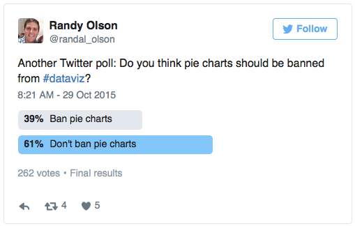
Oh, the poor, maligned pie chart. The chart type that gets pushed around and bullied on the data-viz playground more than any other. Randal Olsen of /r/dataisbeautiful ran a Twitter poll asking, “Do you think pie charts should be banned from #dataviz?” Scientific or not, nearly two in five responded affirmatively:

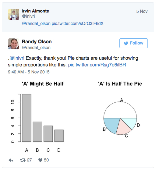
That’s amazing if you stop and think about it. Almost 40 percent of respondents, likely mostly data viz enthusiasts who follow Olsen, think that pie charts should never, ever, ever be used. Hilariously, Andy Kirk of Visualising Data asked whether we should also run a poll about whether those people should be banned, and Irvin Almonte’s response was sheer genius:

The answer: It depends. Say it with me: IT DEPENDS.
Pie charts, in certain instances, can actually be more effective than bar charts at showing specific part-to-whole comparisons. And if the part-to-whole relationship is far more important to your message than comparing, uber-accurately, between categories, and if there are a very small number of slices, go ahead, give thought to using a pie chart. Don’t be intimidated by pie-chart haters. There, I said it.
For more of my ideas on data visualization, check out my blog, DataRemixed, and my Tableau Public page.
