Misleading graphs are abound on the internet. Sometimes they are deliberately misleading, other times the people creating the graphs don’t fully understand the data they are presenting. “Classic” cases of misleading graphs include leaving out data, not labeling data properly, or skipping numbers on the vertical axis.
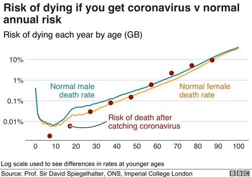
I came across the following misleading graphic in a recent Forbes article. The graph originated with data from Prof. Sir David Spiegelhalter , Winton Professor of the Public Understanding of Risk at the University of Cambridge and Senior Scientist in the MRC Biostatistics Unit. At first glance, a graph originating from an eminent scientist like Sir Spiegelhalter hardly seems worthy of inclusion in an article titled “Misleading graphs”, but can you spot the problem(s)?

Although I’m a statistician by trade, I’ve had a pet interest in misleading graphs and statistics for many years. So when I look at a graph like this, my first scan is with somewhat critical eyes, or “What would a layperson think?” Forget for a moment, that you’re a data scientist, statistician, or numberphile. Imagine you’re just an average Joe with a fairly basic understanding of statistics, and take a look at the graph again.
The first thing I noticed about this graph wasn’t anything to do with coronovirus, but rather the 10% chance of dying each year (for octagenarians). My dad is 88-years-old, and according to this graph, he has a 90% chance of making it to 89. And, if he makes it to 89, he has a 90% chance of making it to 90. If he lives to 100? The odds jump a little (to perhaps 18 or 19%, but that still isn’t too bad). That actually sounds like pretty good odds he’ll make it to 120, right? Or possibly 130, if he’s one of the lucky ones that have around a 80-90% chance of making it through the year. There’s obviously something wrong with this picture, but what?
Problem #1: Missing Numbers on the Vertical Graph
The graph suffers from three major problems. The first is one of the most common problems that causes misleading graphs: skipping numbers on the vertical axis.
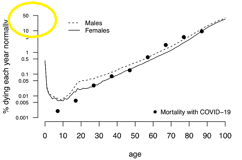
I tracked down another version of the graph on Medium.com. Bear with me a moment; I know that Medium.com doesn’t have the prestige of Forbes, but in this case their graph is more informative as it doesn’t have a truncated vertical axis. Note the yellow circle that clearly shows a huge jump from 10 to 50%. This part of the axis was missing in the Forbes article.

Now, this version of the graph makes a little more sense. Note that the odds of dying increases significantly after age 85 or so. In fact, the odds jump to around 50% for each year. Your life expectancy if you make it to 105? Just 1.5 more years (Berkeley).
Problem #2: Muddying the Message
Another problem that causes misleading graphs is more subtle. Sometimes, over-enthusiasm can cause you to pack too much information into a graph, muddying the message you’re trying to convey. The Forbes version of the graphic suffers from this problem. The graph is clearly labeled with “Normal male death rate” and “Normal female death rate“. In fact, those sections of the graph are given equal weight to “risk of catching death after coronavirus“. So, the equal weights give the impression that the graph isn’t only about coronavirus, it’s information about death rates in general. Compare that to the Medium.com graph. The “normal” death rates are relegated to two words (males / females), leaving the viewer with a clearer idea about what the message of the graph really is: mortality with Covid-19.
Problem #3: Oh, Logarithms
The second problem with the graph is the choice of scale. The small print at the bottom of graph #1 tells you that it’s in the log scale. Sure, scientists might be well-versed in logarithm scales, but the general public is not: even college students struggle with the esoteric nature of logarithms (Mulqueeny, 2012). The second graph is far from perfect because it doesn’t mention the logarithmic nature of the scale at all, which is another problem with graphs you’ll want to avoid: always report the scale you’re using (especially important if it’s an esoteric one!).
The Solution?
Part of a data scientist’s job is to make sense of large amounts of data and present that data in a readily understandable format to colleagues, the general public, other other “non-technical” audiences. Your audience is relying on you to cherry pick wisely, producing accurate graphs that are easy to read and understand. So it’s vitally important for you to produce graphs that are understandable to the layperson. Don’t make the mistake of trimming the edges (as this Forbes article did) in order to save space. Use straightforward percentages instead of logarithms. And verse yourself with the common types of misleading graphs so that you can avoid giving your audience the wring message.
Next: Misleading Graphs Part 2: Ladders, Spaghetti, and Other Ways to Rui…
References
Mulqueeny, E. (2012). How do students acquire an understanding of logarithmic concepts? Retrieved May 31, 2020. https://etd.ohiolink.edu/!etd.send_file?accession=kent1340912890&disposition=attachment
