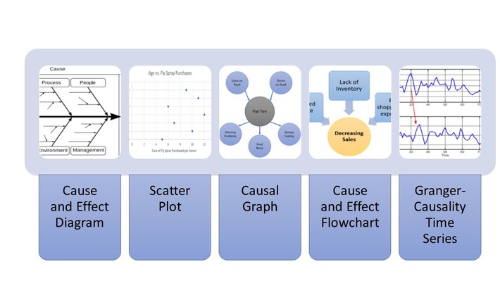
- Cause-and-effect relationships can be visualized in many ways.
- Five different types of graphs explained, from simple to probabilistic.
- Suggestions for when to use each type.
If your data shows a cause and effect relationship and you want to convey that relationship to others, you have an array of choices. Which particular graph you choose largely depends on what information you’re dealing with. For example, use a scatter plot or cause-and-effect flowchart if you want to show a causal relationship (i.e. one that you know exists) to a general audience. But if you need to graph more technical information, another chart may be more appropriate. For example, time-dependent data that has a causal relationship to data in another time period can be demonstrated with Granger Causality time series.
Contents:
- Cause and Effect (Fishbone) Diagram
- Scatter Plot
- Causal Graph
- Cause and Effect Flowchart
- Granger-causality Time Series
1. Cause and Effect (Fishbone) Diagram
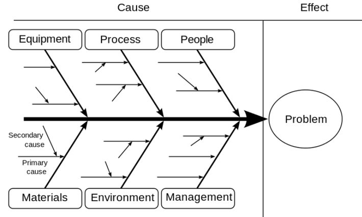
A cause and effect diagram, also called a fishbone or Ishikawa diagram, can help in identifying possible causes of a problem. It’s a discovery tool that can help uncover causal relationships. Use when you want to [1]:
- Brainstorm potential causes of a problem.
- Identifying possible causes that might not otherwise be considered.
- Sort ideas into useful categories.
The problem or effect is shown at the “head” of the fish. Possible causes are listed on the bones under various categories.
2. Scatter Plot
Scatter plots are widely available in software, including spreadsheets. They have the distinct advantage that they are easy to create and easy to understand. However, they aren’t suitable for showing every cause-and-effect relationship. Use a scatter plot when you want to:
- Show a simple association or relationship (e.g. linear, exponential, or sinusoidal) between two variables.
- Convey information in a simple format to a general audience.
A scatter plot can never prove cause and effect, but they can be an effective way to show a pre-determined causal relationship if you have determined that one exists.
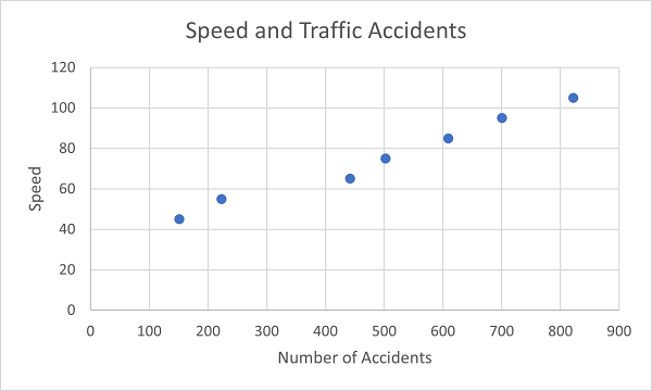
The following scatter plot shows a linear increasing relationship between speed and traffic accidents:
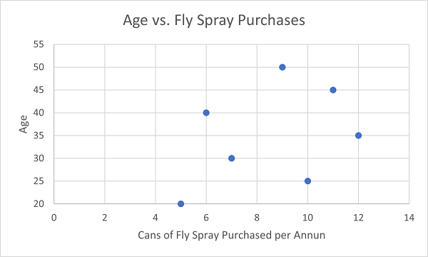
Scatter plots can also be useful in showing there isn’t a relationship between factors. For example, this plot shows that there isn’t a relationship between a person’s age and how much fly spray purchased:
If you have more that two variables, multiple scatter plots combined on a single page can help convey higher-level structures in data sets [2].
3. Causal Graphs
A causal graph is a concise way to represent assumptions of a causal model. It encodes a causal model in the form of a directed acyclic graph [3]. Vertices show a system’s variable features and edges show direct causal relationships between features [4].
Use when you want to:
- Show causal relations from A to B within a model.
- Analyze the relationships between independent variables, dependent variables, and covariates
- Include a set of causal assumptions related to your data.
- Show that the joint probability distribution of variables satisfy a causal Markov condition (each variable is conditionally independent with all its nondescendents, given its parents) [5].
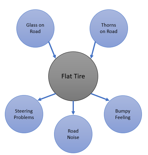
If you don’t put an arrow between variables in a causal graph, you’re stating those variables are independent of each other. In other words, not putting arrows in is as informative as putting arrows in. For example, the following graph shows that while glass and thorns can cause a flat tire, there’s no relationship between those two factors:
4. Cause and Effect Flowchart
A cause and effect flowchart is a simple way to show causation. It can be particularly effective when you want to convey the root causes for a particular problem without any probabilistic components. Use when you want to show which events or conditions that led to a particular effect or situation [6]. For example, the following cause and effect flowchart shows the main causes for declining sales for a hypothetical web-based business: 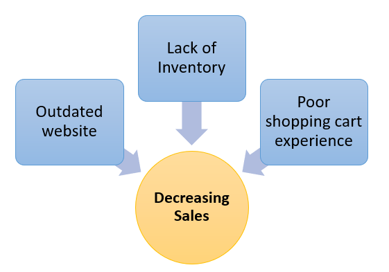
5. Granger-causality Time Series
Granger causality is a probabilistic concept of causality that uses the fact that causes must precede their effects in time. A time series is Granger causal for another series if it leads to better predictions for the latter series.
The following image shows a time series X Granger-causing time series Y; The patterns in X are approximately repeated in Y after some time lag (two examples are indicated with arrows).
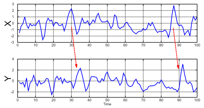
Although Granger-causal time series can be an effective way of showing a potential causal relationship in time-dependent data, temporal precedence by itself is not sufficient for establishing causeeffect relationships [7]. In other words, these graphs are ideal for showing relationships that you know exist, but not for proving one event that happening in a certain period of time caused another.
References
Fishbone Diagram: FabianLange at de.wikipedia, GFDL, via Wikimedia Commons
Granger-causality Time Series: BiObserver, a href=”https://creativecommons.org/licenses/by-sa/3.0%3ECC”>https://creativecommons.org/licenses/by-sa/3.0>CC BY-SA 3.0 via Wikimedia Commons
Other images: By Author
[1] How to Use the Fishbone Tool for Cause and Effect Analysis.
[2] Scatter Plot.
[3] Pearl, J. (2009b). Causality: Models, Reasoning, and Inference. 2nd ed. Cambridge: Cambridge University Press.
[4] Having the Right Tool: Causal Graphs in Teaching Research Design
[5] Integrating Multiple Information Resources to Analyze Intrusion Alerts
[6] Cause and Effect Flowchart.
[7] Causal inference with multiple time series: principles and problems
