This article was written by Nathan Yau.
It used to be that we’d see a poorly made graph or a data design goof, laugh it up a bit, and then carry on. At some point though — during this past year especially — it grew more difficult to distinguish a visualization snafu from bias and deliberate misinformation.
Of course, lying with statistics has been a thing for a long time, but charts tend to spread far and wide these days. There’s a lot of them. Some don’t tell the truth. Maybe you glance at it and that’s it, but a simple message sticks and builds. Before you know it, Leonardo DiCaprio spins a top on a table and no one cares if it falls or continues to rotate.
So it’s all the more important now to quickly decide if a graph is telling the truth. This a guide to help you spot the visualization lies.
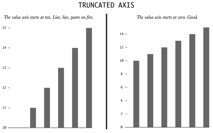
Bar charts use length as their visual cue, so when someone makes the length shorter using the same data by truncating the value axis, the chart dramatizes differences. Someone wants to show a bigger change than is actually there.
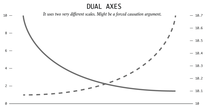
By using dual axes, the magnitude can shrink or expand for each metric. This is typically done to imply correlation and causation. “Because of this, this other thing happened. See, it’s clear.”
The spurious correlations project by Tyler Vigen is a great example.
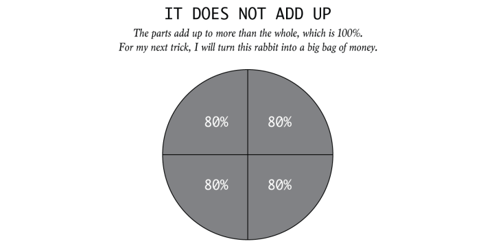
Some charts specifically show parts of a whole. When the parts add up to more than the whole, this is a problem. For example, pie charts represent 100 percent of something. Wedges that add up to more than that? Peculiar.
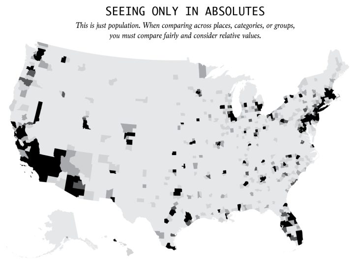
Everything is relative. You can’t say a town is more dangerous than another because the first one had two robberies and the other only had one. What if the first town has 1,000 times the population that of the first? It is often more useful to think in terms of percentages and rates rather than absolutes and totals.
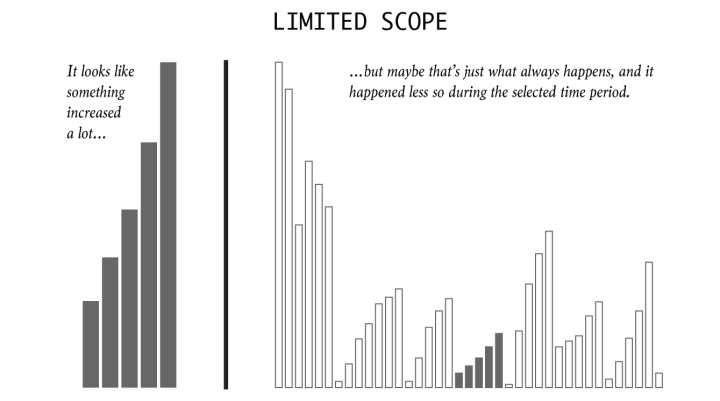
It’s easy to cherrypick dates and timeframes to fit a specific narrative. So consider history, what usually happens, and proper baselines to compare against.
Interesting things can show up when you look at the big picture.

Instead of showing the full range of variation in a dataset, someone might try to oversimplify a complex pattern. It’s easy to transform a continuous variable into a categorical one.
Broad binning can be useful, but complexity is often what makes things worth looking at. Be wary of oversimplification.
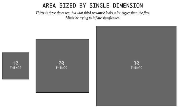
If area is the visual encoding, then one has to size by area. When someone linearly sizes an area-based encoding, like a square or a circle, they might be sniffing for dramatics.
Sometimes, it’s an honest mistake. So be wary.
To read the full original article click here. For more data visualization related articles on DSC click here.
DSC Resources
- Services: Hire a Data Scientist | Search DSC | Classifieds | Find a Job
- Contributors: Post a Blog | Ask a Question
- Follow us: @DataScienceCtrl | @AnalyticBridge
Popular Articles
