Summary: This is a lesson in how it may be possible to snatch victory from the jaws of defeat. 1.) A good ROC score does not necessarily mean a good model. 2.) Even a weak model may be good at the top and bottom – consider how you can use that.
This is a lesson in how it may be possible to snatch victory from the jaws of defeat. In our world, defeat is ending up with a poor model that doesn’t do what you’d hoped. This story about a particular project of mine has two valuable teaching points.
- The shape of the ROC curve, not just its area score really matters.
- Sometimes eliminating the losers can be just as good as picking the winners.
Particularly the second point about redefining the project objective can be the key to achieving success where failure looks likely.
About the Project
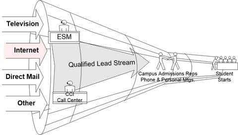
 This project was a pretty classical marketing project designed to predict lead conversion for a for-profit college. Their student acquisition process took in phone calls, emails, and physical mail driven by television and print advertising and through two steps of human screening, converted raw leads to enrolled students at about a 5% rate.
The recruiting process was incredibly expensive and accounted for about 25% of their gross revenue, about $175 per lead and $2,500 per enrolled student. The task was to make the lead intake and conversion process more efficient by predicting which leads were better than others. Once we knew that (scoring) we could redesign the intake process to spend more on the high liklihood leads and less on the least likely. In traditional manner, we took the information we had and added append data from a service like Equifax.
Lesson 1: The Shape of the ROC Curve Matters
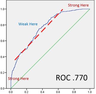
 I’ve had models that didn’t show much lift but this one looked pretty good based on a ROC value of .770.
But in truth it was a lousy model and one I’ve shown to many young predictive modelers to make this point. It’s about the shape.
What should be apparent is that while the first two deciles and the last two deciles were strongly predictive, in the important middle part, the curve was practically parallel to the 45 degree random line.
The point of course is to be able to construct a decile profit & loss analysis that shows a clear cutoff point where the cost of promotion exceeds the return. When we prepared the P&L however the 3rd through 8th decile flip-floped between profit and loss making it impossible to find a valid economic cutoff point.
Lesson 2: Redefining the Objective to Eliminate the Worst, Not Find the Best
Ultimately we changed modeling techniques and selected a slightly less accurate technique (minor reduction in the ROC score) but which had a more robust curve through the center. While we were doing this however, our conversation began to focus on the bottom or worst deciles that had very few conversions.
Redesigning the whole lead funnel would have been costly and time consuming but we flipped the problem on its head, and asked what would be the impact of rerouting the lowest probability leads.
As it happened, any lead that passed the first human screen was passed on to the campus recruiters as equally hot leads. They were not. As a result the very time intensive and expensive second conversion step by the campus recruiters were overloaded at peak times of the year. This undoubtedly meant that during these peaks they were losing conversions by spending as much time on the weak leads as the strong ones.
Top that off with an overall conversion cost of $2,500 per enrolled student and they were missing out on a lot of revenue.
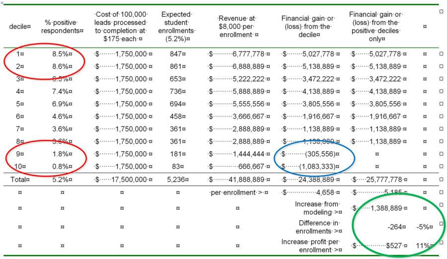
Here’s what the P&L analysis looked like. There’s a lot of detail so just focus on these facts:
- In the red circles you can see that the bottom two deciles totaled only 2.6% of conversions compared to the top two deciles that held 17.1% more than a 6:1 difference.
- In the blue circle, those bottom two deciles were actually losing $1.4 Million per year and distracting the recruiters from spending more time with qualified candidates.
- In the green circle, by eliminating this process for the bottom two deciles they lost about 5% of enrollees but saved the $1.4 Million which increased their profit per enrollee by 11%.

So in the end, incoming leads were matched with append data in near real time and scored. The bottom two deciles were simply mailed additional information which pretty much eliminated all their cost. If they were still interested they could call back into the system and be rescored into a higher decile so the good ones weren’t actually lost.
So the takeaway is this.
- Even a poor model can be good at the top and bottom ends.
- Sometimes eliminating the worst leads, where the cost of conversion is high, is a better economic deal than trying to rank everyone.
About the author: Bill Vorhies is Editorial Director for Data Science Central and has practiced as a data scientist and commercial predictive modeler since 2001. He can be reached at:
