by Chris McLean & Peter Bruce

Never before have statistical models received the attention they are getting now in the midst of the Coronavirus pandemic. It is hard to read a news feed today without encountering either:
- New predictions from models such as the IHME model and others, or
- Critiques of older predictions.
So – how have older predictions turned out?
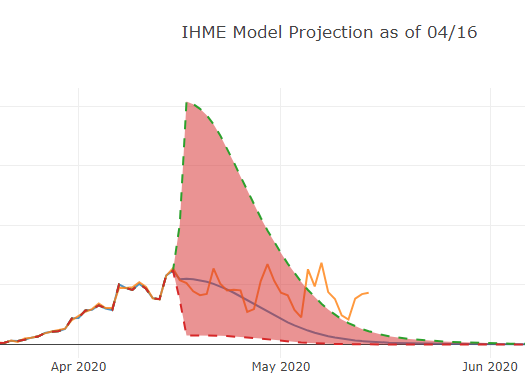
If you’ve been paying attention to the news, you’ll know the answer is “not so well.” Consider this prediction from April 16 for the IHME (University of Washington “Murray”) model:

Figure 1: Deaths per IHME predictions
Actual deaths after the prediction was made – the orange up and down line – not only exceeded the line estimate (the smooth downward-sloping curve) but eventually exceeded and stayed above the upper bounds of the uncertainty interval. And the uncertainty interval itself is curious – why is it so large right after the final actual data point, when uncertainty is at its least, and so much smaller later, when uncertainty would be greatest?
It is easy to take pot shots at specific models and predictions at given points in time; the only predictions that are correct 100% of the time are those that are made after the fact. And it is important to note that the IHME model changed dramatically over time as new data became available. Initially, it was based exclusively on the Wuhan data from China, data no longer considered reliable. Then data from Italy and Spain were added in. More recently, improvements have been made to the way uncertainty levels are calculated so that they better reflect the real-world scenario.
A Tool For Visualizing Prior Forecasts
Here we present a tool that allows users to go back and visualize changes in model projections over time and compare the projections with what actually happened. We have collected data and examined models from the IHME and Los Alamos National Lab as these organizations maintained a history of their projections. We compared them to data retrieved from covidtracker.com (pulled from the Johns Hopkins University aggregation site). We put the projections and the data together in an interactive visualization tool; the plot above is the result of selecting one model at one point in time. You can try the COVID Model Visualization Tool here. [note – you need to change “CI” to “UI” in the visualization tool legend]
These models were scored for R2 and MAPE, coefficient of determination and Mean Absolute Percent Error, respectively; both are measures of how well the model predicted the data [1]. Generally, the Los Alamos model outperformed the IHME model which had a temporary very large variance in its predictions for April 5th’s projection. Both struggled in some areas and both had strong points.
For example, the Los Alamos model generally has a wider variance in the 95% Uncertainty Interval (UI) than the IHME model, but its MAPE and R2 are better. And, as noted above, the IHME projected 95% UI does not cover actual recorded data beginning on its projection of April 16th. On the other hand, the IHME projection seems to pick up on the weekly ‘seasonality’ of the data and corrects for the fact that recorded deaths seem to follow a trend throughout the week. See our blog on this point.
Conclusion
Many critical decisions are being made on the basis of ever-changing projections – projections that the public increasingly are finding surprisingly volatile. There are several ways people have been coping with this volatility:
- Believe nothing
- Believe the latest prediction/analysis in your news-feed
- Cherry-pick and choose the analysis that suits your predilections
- Form your own picture based on continuous assessment and re-assessment
The fourth option is the hardest one to execute, but it is the proper choice for those who want to find the truth from data. The visualization tool introduced here should help.
Acknowledgment
The authors would like to thank Sam Ballerini and Andrew Stewart for their work in helping to create the visualization tool introduced here. Reader comments invited using the comments section below.
