This article was posted by Roberto Rösler on his personal blog about R and data mining. Roberto is a data scientist working at a major telecommunication company in Germany.
Introduction
Happy new year to all of you. Even if you still fight with the aftereffects of your new year’s party, the following is something that may help in getting you more active because that’s it what this blog post is about – Activity.
Regardless of the business you are working in, I bet that customer activity is something that matters. An active customer typically is someone who is receptive for offers, whereas non-activity is a good indication for increasing churn probability or simply for a deteriorating customer relationship. That’s why we try to keep our customers happy and engaged. Because of that different groups in business would benefit from monitoring changes in customer activity. For example, marketing will send a special offer to the customer if activity increases or a sales agent contact and ask if he or she can help increase current capabilities. Customer care can call if they see a drop in usage and ask if there is any problem and how they can assist. For all this algorithms developed for change detection provide a perfect fit, as they provide you the information when a change in customer activity occurred.
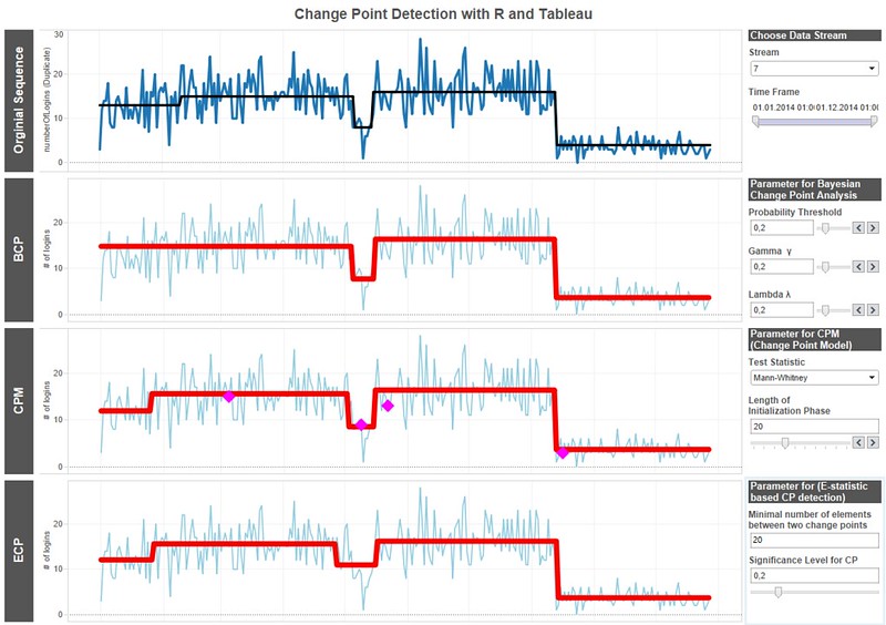
This blog post will show, how to apply such algorithms to univariate time series representing customer activity and present the results graphically. Visualizing the identified breaks provide an additional benefit for understanding customer behavior and also how those algorithms work.
Data Understanding and Preparation
Let’s start by having a look at the data used in this article. Customer activity appears in multiple forms and it depends on the type of business, the product and the technical platform, what is measurable or not. During first experiments at work, I had to deal with login information which in essence consists of an ID and a time stamp of the login. It showed up that the number of logins per day is highly correlated with monthly revenue and a low churn probability and therefore monitoring of this kind of KPI was strongly advised. As this kind of data cannot made public, I’ll use some artificial data for this posting. A nice side-effect of this approach is that we know the exact properties for the artificial data and can compare them with the outcome of the statistical modeling. This makes it a lot easier to understand which method is the best to be used for the data at hand. A simple way to approximate a sequence of count data is to draw random numbers from a Poisson distribution. The only parameter is the average number of events called lambda. Lambda can be translated as the average number of logins per day. To simulate login data for a couple of hypothetical customers the R script can be used.
To see the R script, click here.
DSC Resources
- Free Book: Applied Stochastic Processes
- Comprehensive Repository of Data Science and ML Resources
- Advanced Machine Learning with Basic Excel
- Difference between ML, Data Science, AI, Deep Learning, and Statistics
- Selected Business Analytics, Data Science and ML articles
- Hire a Data Scientist | Search DSC | Classifieds | Find a Job
- Post a Blog | Forum Questions

