New & Notable
From cloud costs to edge control – Modular data centers for sustainable and efficient AI
Dan Wilson | November 19, 2025 at 10:30 amBeyond Copilots – The rise of agentic engineering
Janne Saarela | November 19, 2025 at 10:27 amTop Webinar
From cloud costs to edge control – Modular data centers for sustainable and efficient AI
Dan Wilson | November 19, 2025 at 10:30 amRecently Added
How AI is used in cybersecurity
Martin Summer | November 19, 2025 at 12:25 pmDiscover how AI is revolutionizing cybersecurity with advanced threat detection, predictive analysis, and automated resp...
Metadata: How data about your data is optimal for AI
Kevin Vu | November 19, 2025 at 12:19 pmDiscover how metadata enhances AI performance by providing crucial context for models. Learn key benefits, implementatio...
Beyond Copilots – The rise of agentic engineering
Janne Saarela | November 19, 2025 at 10:27 amGenAI is evolving – fast. What started as helpful Assistants (Copilots) providing suggestions and insights is now morp...
The hidden price of not being AI-ready
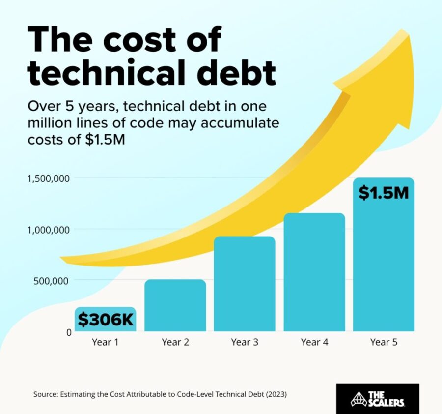
Rudrendu Paul | November 5, 2025 at 5:40 pmDiscover the hidden price of not being AI-ready. Learn how enterprise legacy data warehouses accumulate technical debt, ...
Human intelligence research lab to rank LLMs?
David Stephen | November 4, 2025 at 3:14 pmIf AI can pass a CFA Level III exam in minutes, and people still say AI is not intelligent, then what else would intelli...
Is OpenAI creating a global compute monopoly?
Jelani Harper | October 31, 2025 at 9:22 amLast month, OpenAI announced a strategic partnership with Nvidia, which enables the AI powerhouse to deploy 10 gigawatts...
Best practices that break data platforms
Saqib Jan | October 22, 2025 at 11:59 amEvery data engineering team operates on a set of accepted principles, a playbook of "best practices" intentionally desig...
The rise of accountable AI agents: How knowledge graphs solve the autonomy problem
Jans Aasman | October 15, 2025 at 10:09 amAcross the tech sector, the term ‘AI agent’ has become Silicon Valley’s latest Rorschach test—revealing more abo...
The key to conversational speech recognition
Jelani Harper | October 9, 2025 at 2:32 pmAdvancements in statistical AI applications for understanding and generating text have been nothing short of staggering ...
How to Get AI to Deliver Superior ROI, Faster
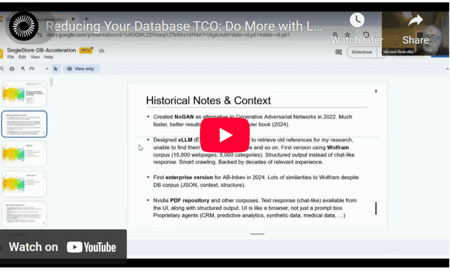
Vincent Granville | October 1, 2025 at 3:59 amReducing total cost of ownership (TCO) is a topic familiar to all enterprise executives and stakeholders. Here, I discus...
New Videos
Swiss Vault is bringing hyperscaler power to everyone
Interview with Bhupinder Bhullar In a world increasingly dominated by AI, massive data creation, and energy-hungry compute infrastructure, the question isn’t just how to store…
A/B Testing Pitfalls – Interview w/ Sumit Gupta @ Notion
Interview w/ Sumit Gupta – Business Intelligence Engineer at Notion In our latest episode of the AI Think Tank Podcast, I had the pleasure of sitting…
Davos World Economic Forum Annual Meeting Highlights 2025
Interview w/ Egle B. Thomas Each January, the serene snow-covered landscapes of Davos, Switzerland, transform into a global epicenter for dialogue on economics, technology, and…


