This article was posted by Dikesh Jariwala on R Bloggers.
With ever increasing volume of data, it is impossible to tell stories without visualizations. Data visualization is an art of how to turn numbers into useful knowledge.
R Programming lets you learn this art by offering a set of inbuilt functions and libraries to build visualizations and present data. Before the technical implementations of the visualization, let’s see first how to select the right chart type.
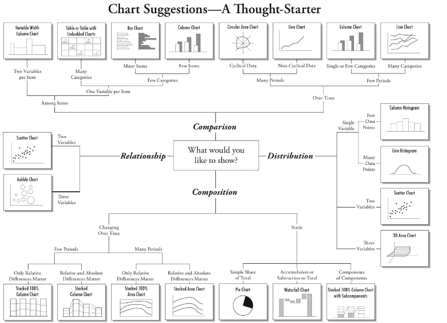
Selecting the Right Chart Type
There are four basic presentation types:
- Comparison
- Composition
- Distribution
- Relationship
To determine which amongst these is best suited for your data, I suggest you should answer a few questions like,
- How many variables do you want to show in a single chart?
- How many data points will you display for each variable?
- Will you display values over a period of time, or among items or groups?
Below is a great explanation on selecting a right chart type by Dr. Andrew Abela.
In your day-to-day activities, you’ll come across the below listed 7 charts most of the time.
- Scatter Plot
- Histogram
- Bar & Stack Bar Chart
- Box Plot
- Area Chart
- Heat Map
- Correlogram
To learn about the 7 charts listed above, click here. For more articles about R, click here.
Top DSC Resources
- Article: What is Data Science? 24 Fundamental Articles Answering This Question
- Article: Hitchhiker’s Guide to Data Science, Machine Learning, R, Python
- Tutorial: Data Science Cheat Sheet
- Tutorial: How to Become a Data Scientist – On Your Own
- Categories: Data Science – Machine Learning – AI – IoT – Deep Learning
- Tools: Hadoop – DataViZ – Python – R – SQL – Excel
- Techniques: Clustering – Regression – SVM – Neural Nets – Ensembles – Decision Trees
- Links: Cheat Sheets – Books – Events – Webinars – Tutorials – Training – News – Jobs
- Links: Announcements – Salary Surveys – Data Sets – Certification – RSS Feeds – About Us
- Newsletter: Sign-up – Past Editions – Members-Only Section – Content Search – For Bloggers
- DSC on: Ning – Twitter – LinkedIn – Facebook – GooglePlus
Follow us on Twitter: @DataScienceCtrl | @AnalyticBridge

