
 Before we start, what is Power BI in the first place? As stated on its website: “Power BI is a suite of business analytics tools that deliver insights throughout your organization.”
It is, by all means, no exhaustive definition of this instrument. The comprehensive set of features enables easy to use data import from a variety of files, simple to handle data transformations, beautiful visualizations with interactivity, and even more. Also, there are several possible ways to work with Power BI: Power BI Web, Mobile, Embedded, Desktop App.
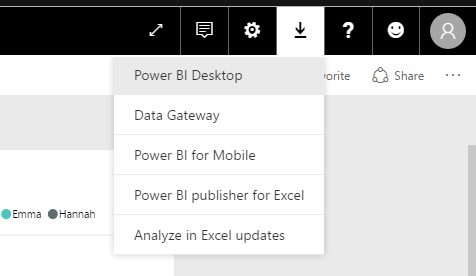
In this quick intro to Power BI, we will use the Desktop version. You can download it either by selecting Power BI Desktop in the product menu on the main page or, in case you are already registered and signed in, you can click download button near your account icon.
To install it, simply run PBI_desktop_x64/32.msi file, which you have just downloaded, and follow straightforward installation wizard prompts. The next step is to sign in to Power BI with your account. If you already have one, just use your credentials; otherwise, click “Get started free” on the main page of the website and fill in the registration form, then sign in with your freshly created account. Now, we are ready to explore.
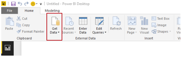
To begin with, we need to import the data. As an example, we have chosen to use the Top Baby Names in the USA dataset. For the next step click “Get Data” on the Home bar on the very top of Power BI window.
You will be prompted to choose from where you want to import and which file format to use. For now, we will connect the local file of plain CSV format.
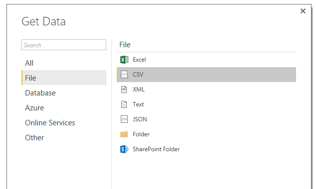
Navigate to the folder where the downloaded data is located, choose it and click “Open”. At this point, you will get a preview of your data in the table form.
There are several options available here:
- you may import data as is, without any modifications and tuning;
- you may just change the way data types are detected; here we have chosen to detect on the entire document (probably do not want to do that on really big data sets);
- and finally, we can modify data (by clicking “Edit”).
There is actually one minor problem with the data here – the Year field is detected in whole numbers format. It is not going to cause errors or miscalculations in the future analysis (a year is a whole number after all), but it will cause some inconvenience such as obscure labeling.

We want the years to be points on the timeline or in other words – timestamps, instead of flat numeric values. To perform this transformation, we will go ahead and edit the data set before connecting.
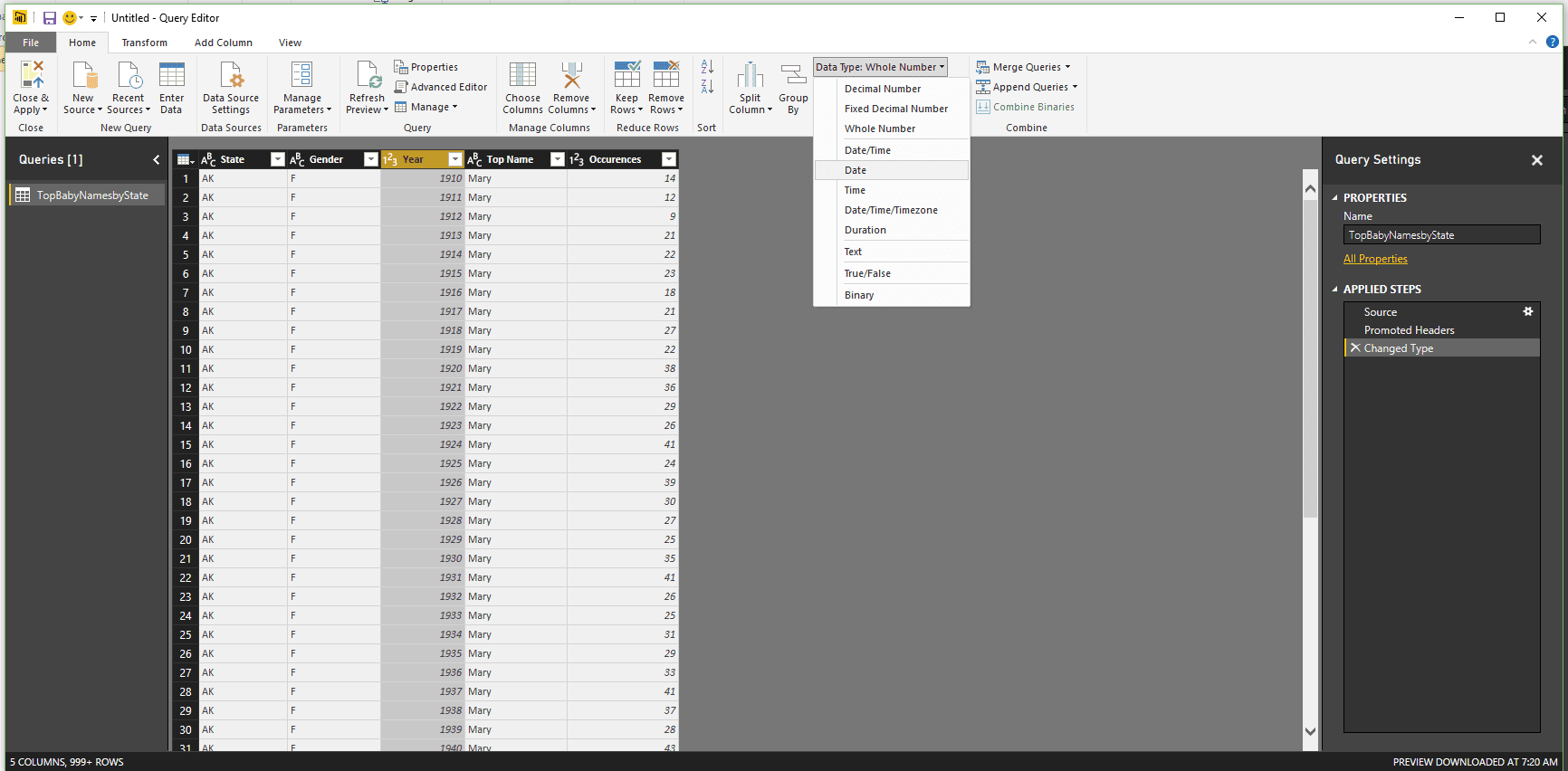
In the window that has just opened, it is very simple to perform all kinds of manipulations with data. It also features the data itself, the log of actions (Applied Steps), and many other handy things. To change the data type of the column – click on it, choose “Data Type” on the Home bar, and then pick the new data type.
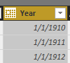
We will have a date type for our Year column. It will append day and month to every entry, but it is not much of a deal for us here. To finish editing, just click “Close & Apply” button on the Menu bar of the current window. And that’s it, our data is imported and ready to be worked with. You may see the indication of this on the fields pane, where a new table is added with the corresponding fields exposed.
Now, let’s get our hands on some visualization.
Before we start, we need to define what we see in the main window. There are three main areas:
-
Report area (big blank sheet), where all the drawing goes;
-
Visualizations pane, where types of visuals are chosen and tuned;
-
Fields pane, which we have already mentioned above.
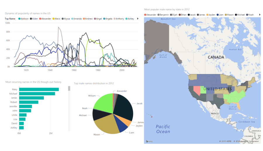
First, we will try to discover the most interesting spots of our data and analyze them. We can begin by outlining the most frequent names throughout the history. To see that, we will expose the quantile relationship between the Occurrences and the Top Names. The most suitable way to show it is to use a bar chart.
To draw plain bar chart (the horizontal one), we will click on Stacked Bar Chart on Visualizations pane. An empty placeholder will pop up in the Report Area. This placeholder is the place to start. It should get in the focus automatically, but if it does not – just click on it.
Right under the visuals types, you may see fields to visualize in this bar chart. Just drag and drop data in corresponding places. We want to see names on the axis and occurrences to define values, so we will drag each one to its place.
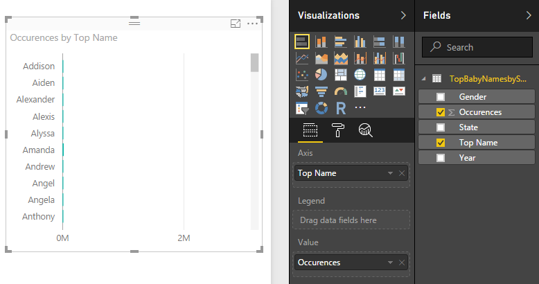
At this point, we have our first visual, but the chart seems too sparse. However, it is not because our data is sparse, it gets intense as you go down, it is just that entries are sorted by Top Name, and we want them to be sorted by Occurrences. We will do that by clicking three dots at top left and choosing sort by occurrence.
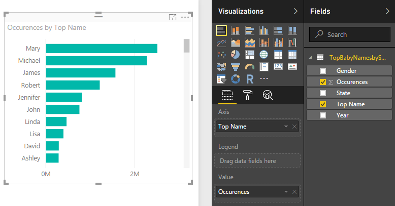
With that, the visualization becomes meaningful, and as you can see we did not change a single field.
To continue, let’s get a different look at our data, now from the time perspective. We will visualize the dynamics of name frequencies over time. The perfect fit for that is a Line Chart, so we choose this one from our visualization types. Next, we will populate our visual with data:
-
as our axis we will take Year field;
-
for values the pick is Occurrences;
-
and finally, the legend will be filled with Top Names field.
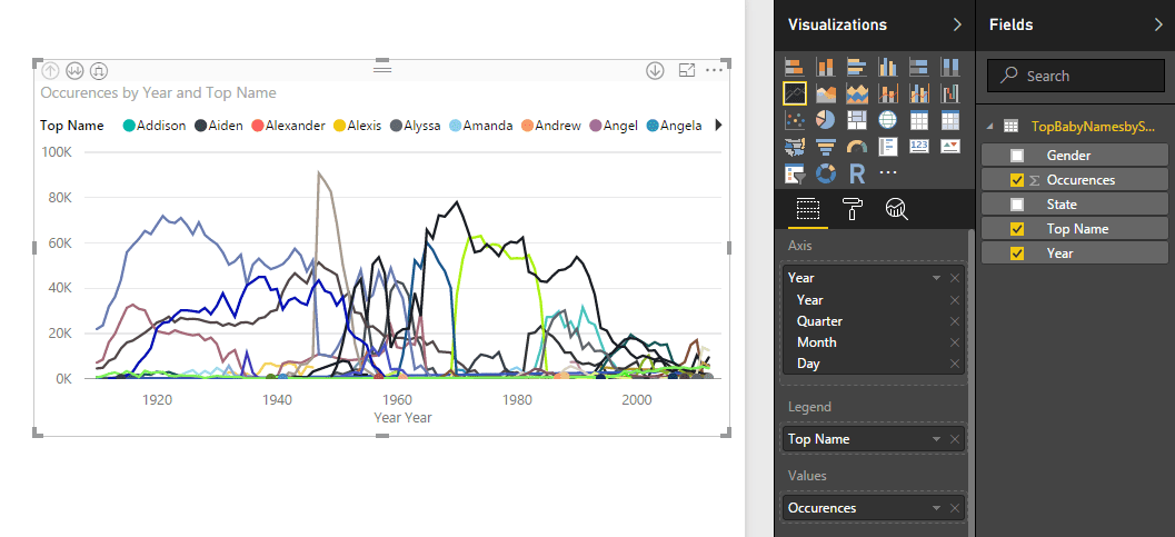 First of all, we want to get rid of this annoying “Year Year” label at the bottom. It is actually not a mistake; it is just the way date type is presented. We can change the way it is shown by clicking on the Year field in axis place and choosing “Year”, instead of “Date Hierarchy”.
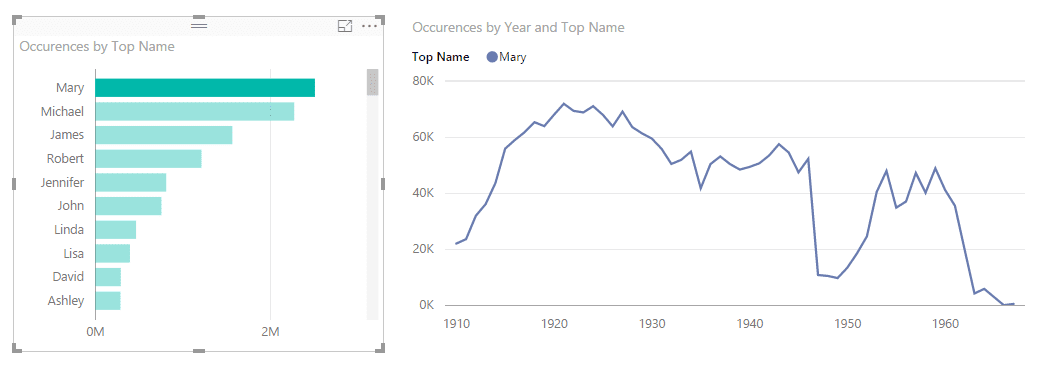
Reports in Power BI are interactive, that means that all charts work in contraction, as one. With that, we can choose entities in one chart, and that will affect the display of another.
For example, in our previous chart, we have seen that name “Mary” is the most reoccurring throughout entire history, and we want to see the dynamics of this name over time. To do that, click on the bar for this name and this will update the display in all charts where this name happens to be. This often comes in handy.

Using Power BI, we always can look at the picture of data as a whole and as parts of one. We can choose specific areas of our dataset by filtering the things we do not want to see on the graph. For our next case, we want to see what male names compose the most popular ones in the last year presented in the dataset. The perfect fit to see the fractions of a whole is a Pie chart.
The process of drawing the chart is the same as previously, but this time we will apply several filters.
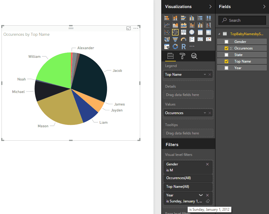
The filters already contain fields that compose the visual. To add new filters without adding them to visualization, we can just drag and drop fields to filters.
First, drag the Year field and set it to the 2012 year. Then, we add Gender field to filters and check it to be male. And that is it.
To finalize our report and show some advanced visualizations Power BI provides, we want to visualize male name distribution for 2012 geographically (across the state).
Power BI gives two default options to visualize geo data: Maps and Filled maps. Our choice will be Filled maps. There are also several ways to specify exact location: Country, State, Country or State codes, longitude and latitude, etc. Our data set has State column with state code inside, so we will use it.
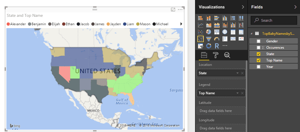
We will use two filters (Gender: male, Year: 2012) and two fields to be shown on our map. For location option we use State and for legend – Top Name field. Power BI will produce the visualization using Bing maps.
Now, before rolling up our report to see the light, we want to give our charts some meaningful titles. We can change that in Format tab of Visualizations pane.
Since we think that our report looks pretty, we want to share that with the world. All you need to do is just save the report and click “Publish” on the Menu bar. The report will get uploaded to the Power BI account. In your account, you can pin entire report or separate charts to a dashboard (new or existing one) and share it by email or via link.
Conclusion
In this tutorial, we’ve got acquainted with the Power BI, a powerful tool and comfortable environment for data visualization and analytics tasks, learned how to create simple graphics and modify them to suit our needs and tastes. This information pretty much wraps up the general usage of Power BI, but there is always more. Amongst other great functionalities are relationship management, custom visualizations, cloud-powered reports, and a whole variety of tools available to your discretion.
You can learn even more of Power BI using its Guided Learning materials and YouTube channel as well as stay tuned with updates and news on Twitter.