

If you read my blog then you’ll probably realize there are a few data related topics that I could talk about for days. This blog dives into a tool called RAW Graphs, which solves for two of them, outlined below.
We need to enable subject matter experts (SMES) to provide data-driven
A subject matter expert is someone who deeply understands a subject area. For example:
- The designer of a web page
- The operations manager of an online business
- The owner of a store
- And many, many more
While SME’s usually don’t have the data related technical skills of a data scientist, they have a deep knowledge of the problem or research area. When conducting analysis, they typically understand the playing field better than anyone else, and are more likely to discover missing data or incorrect biases. More valuable still, they often help identify analytical starting points closer to the proverbial needle in the haystack. As such, they have to be involved in the analysis from the beginning. Ideally, they need to be able to perform the majority of the analysis on their own without their investigation being limited by lack of skills, tools or other resources. As such, any tool that reduces hurdles to SMEs conducting their own analysis is a welcome member of the party.
Data storytelling is a coveted art form
It’s a very difficult task to communicate your data-driven insights in a fair, clear and concise way. Further, how you best represent a scenario visually changes from project to project. A basic excel graph might work well for one project. On the next project, you may need a more complex visualization that would be best created in Tableau, R, d3 etc. In the theme of removing technical barriers to insight, tools which make it easier and faster to tell data-driven stories should be cherished.
What is Raw Graphs
As described on their website; RAW Graphs is an open source data visualization framework built with the goal of making the visual representation of complex data easy for everyone. I found it through Market Cafe Mag, a beautiful U.K.-based zine about data visualization and information story telling. They covered RAW Graphs and the impact the tool makes in their latest issue. Immediately, I wanted to know more about this tool and how it democratizes information storytelling.
Finding data
The best way to get familiar with a tool is to get your hands on it and start playing. To play, we need a dataset. I decided to grab the
data set for traffic violations in the Montgomery County in Maryland. The Montgomery County is an excellent example of using data for good. They make a wide variety of both raw and aggregate data available to the general public through their data Montgomery initiative. Note that this data is also listed in the Open Data Network and the US Governments open data platform.
Understanding the full data set
The dataset is quite large in terms of total records. It is updated daily with traffic violation information from all electronic traffic violations issued in the County. There are 35 columns which contain a variety of geographic, subject (vehicle details, gender, race, etc) and circumstance (factors, outcome, etc) information.
Since the data set is so dense, I narrowed it down to just year-to-date 2018 information as of this blog entry – yes, that’s only the first three weeks of the year! From there, I made a few data formatting tweaks and created two final data sets for visualization in this tutorial. The data set for time series charts has summary information of the type of cars stopped per day in the beginning of January. The data set for frequency or sum total style charts has the full data set but for one day only.
Creating time series charts
Load Your Data
- Go to the RAW Graphs website: http://app.rawgraphs.io/
- Under “Load your Data” select “From URL”
- Enter the URL: https://raw.githubusercontent.com/lgellis/RAWGraphsTutorial/master/…sv
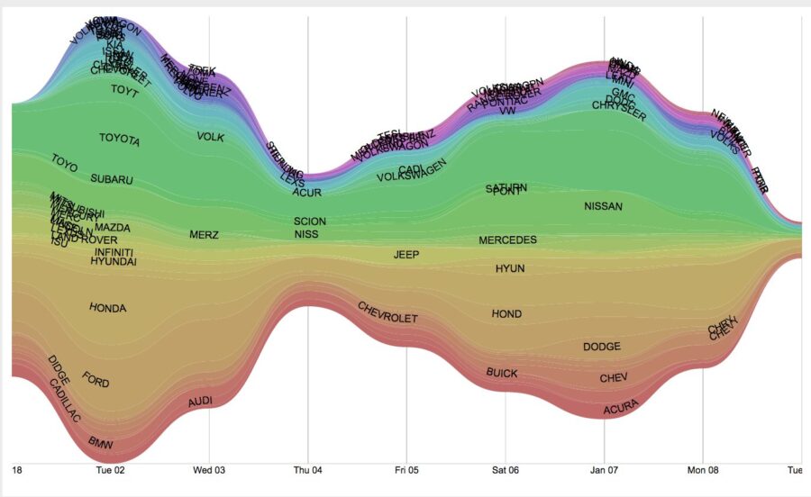
Create a Streamgraph
- Select your chart type. In this case pick Steamgraph. A streamgraph can be used to show relative volumes of data by category over time. In this case, we are looking at the daily car stop total by make.
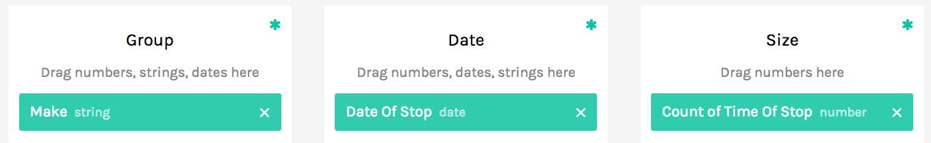
- Drag and drop the columns into the appropriate Group/Date/Size dimensions like the image.
- Voila! Your graph is created!
Bump Chart
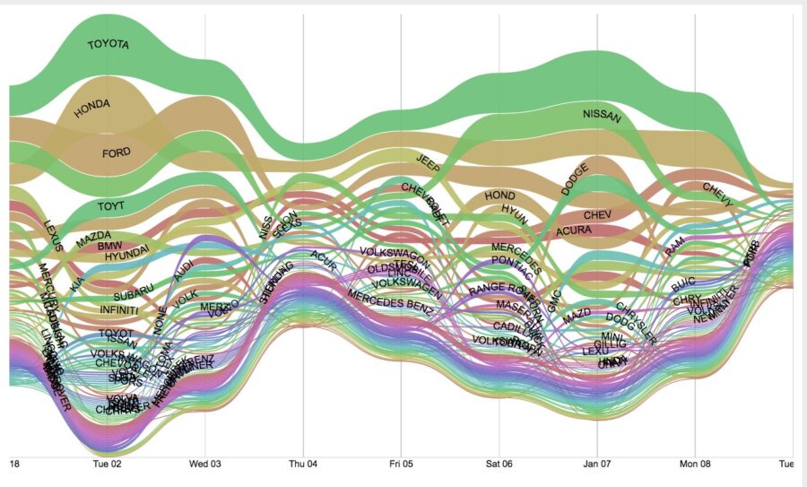
- Select your chart type. In this case pick bump chart. A bump chart can also be used to show relative volumes of data by category over time. In this chart we are also plotting the daily car stop total by make.
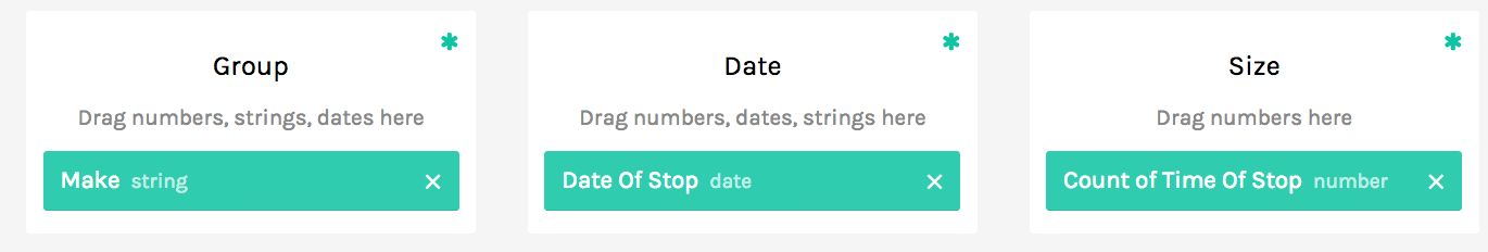
- Drag and drop the columns into the appropriate Group/Date/Size dimensions like the image.
- The chart appears as below.
Load Your Data
- Go to the RAW Graphs website: http://app.rawgraphs.io/
- Under “Load your Data” select “From URL”
- Enter the URL: https://raw.githubusercontent.com/lgellis/RAWGraphsTutorial/master/…
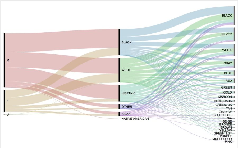
Alluvial
- Select your chart type. In this case, pick Alluvial Diagram. Alluvial charts are a very effective way of understanding clusters or networks of data. In this chart, we are looking at groups by gender, race and car color.
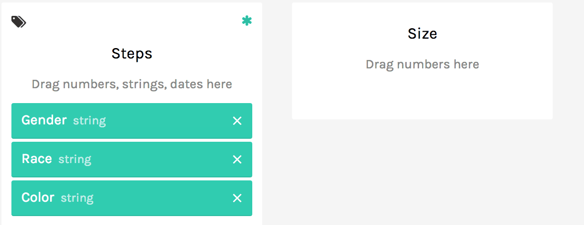
- Drag and drop the columns into the appropriate Group/Date/Size dimensions like the image.
- The chart appears as below.
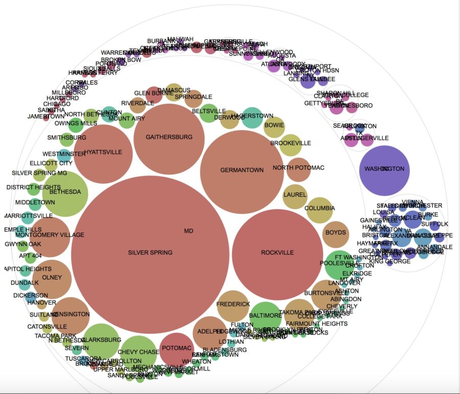
Circle Packing
- Select your chart type. In this case pick Circle Packing. Circle packing charts can also be a great way of understanding the density and heirarchy of data clusters by factors. In this chart we are showing the drivers licence states and cities.
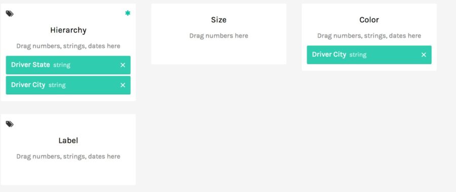
- Drag and drop the columns into the appropriate Group/Date/Size dimensions like the image.
- The chart appears as below.
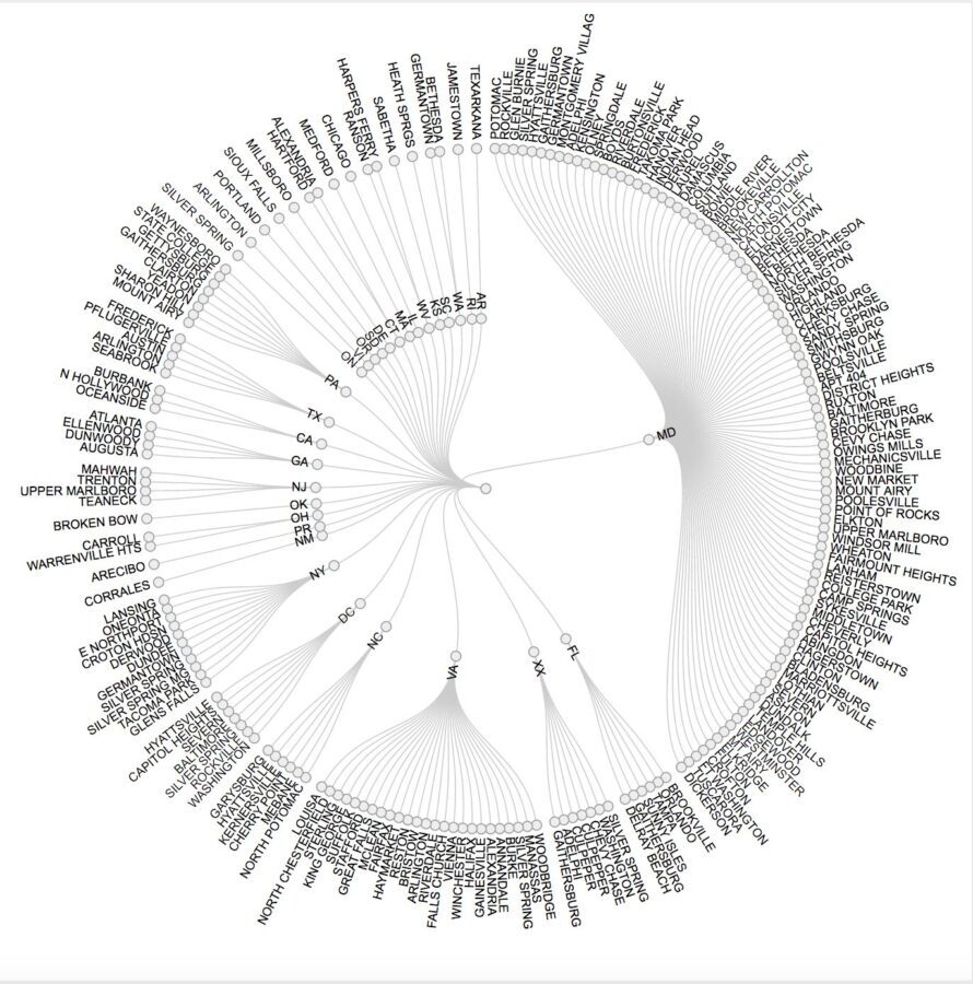
Circular Dendrogram
- Select your chart type. In this case pick Circular Dendrogram. Dendrograms are also a great way of allowing us to understand the relationships between factors in our data set. Here we are also plotting the drivers licencse state and city.
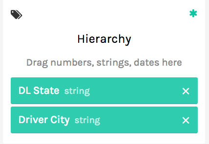
- Drag and drop the columns into the appropriate Group/Date/Size dimensions like the image.
- The chart appears as below.
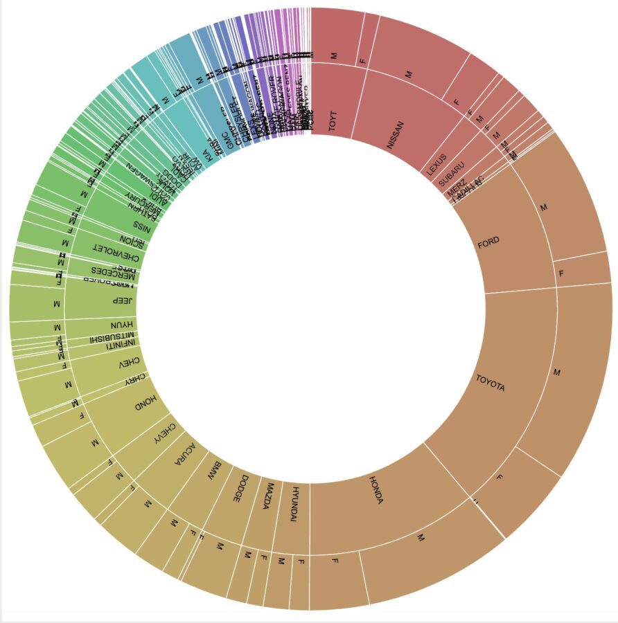
Sunburst
- Select your chart type. In this case pick Sunburst. Sunburst graphs allow us to view volumes of data by factors and clusters of factors. In this chart, we are viewing clusters of drivers gender and chosen car make.
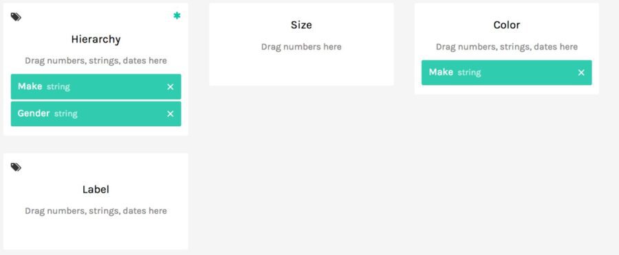
- Drag and drop the columns into the appropriate Group/Date/Size dimensions like the image.
- The chart appears as below.
Thank you
Thank you for exploring the RAW Graphs tool with me. I am very impressed with its capabilities, and will definitely consider it as another sharp tool in the tool belt for future chart creation. Through drag-and-drop we have made some of the most coveted graphs that are typically more easily available through coding tools.
Please comment below if you enjoyed this blog, have questions, or would like to see something different in the future.
Original blog post can be found here
)