
In part 1, I compared a few model evaluation techniques that fall under the umbrella of ‘general statistical tools and tests’. Here in Part 2 I compare three of the more popular model evaluation techniques for classification and clustering: confusion matrix, gain and lift chart, and ROC curve. The main difference between the three techniques is that each focuses on a different type of result:
- Confusion matrix: false positives, false negatives, true positives and true negatives.
- Gain and lift: focus is on true positives.
- ROC curve: focus on true positives vs. false positives.
That said, you’ll want to choose a method that gives you the answers you need for the particular field you’re in. For example, while a confusion matrix can be a great tool for comparing models, it isn’t much good for marketing decisions (where the gain and lift chart would be a better choice).
Other less popular (but still valid) tools include the K-S chart and Gini Coefficient.
Confusion Matrix
A confusion matrix, in predictive analytics, shows the rate of false positives, false negatives, true positives and true negatives for a test or predictor. In machine learning, a confusion matrix can be used to show how well a classification model performs on a set of test data. 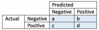
Correctly assigned values appear in their relative diagonal box:
- Negative values are correctly classified as negative (box a)
- Positive values are correctly classified as positive (box d)
Wrongly assigned observations are labeled as either false positives (box b) or false negatives (box c).
- The false positive rate, or proportion of negative cases (incorrectly) identified as positive, is calculated with the equation fpr = b/(a + b).
- The false negative rate tells us what proportion of positive cases were incorrectly labeled as negative. The equation is fnr = c/(c + d).
- The overall accuracy of the prediction or test is defined as (a + d)/(a + c + d + e).
Gain and Lift Charts
Confusion matrices can give you a good idea about how effective your model is. It can also help you choose between multiple competing models.But sometimes you want to know how a particular model does with more data; For example, does a model perform better with 60% of data, compared to 50%? This is where gain and lift charts come in.
The following gains chart, run on a validation set, shows that with 50% of the data, the model contains 90% of targets, Adding more data adds a negligible increase in the percentage of targets included in the model.
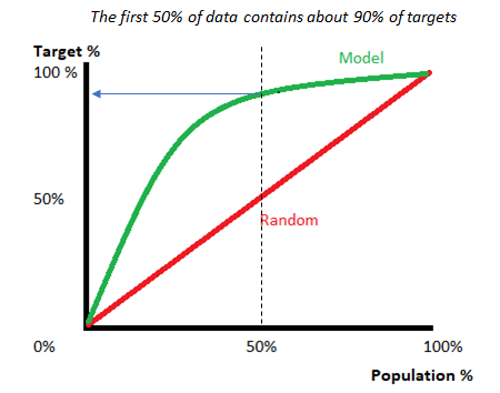
A lift chart shows you how much better your model performs, compared to random selection. The “lift” is the ratio of results with and without the model; Better models have higher lifts.
While the confusion matrix gives proportions between all negatives and positives, Gain and lift charts focus on the true positives. One of their most common uses is in marketing, to decide if a prospective client is worth calling.
Gain and lift charts work with a sample (a fraction of the population). In comparison, a confusion matrix uses the whole population to evaluate a model.
ROC Curve
A Receiver Operating Characteristic (ROC) Curve is a way to compare models. It is a plot of the true positive rate against the false positive rate. It’s similar to the gain and lift chart, but instead of just true positives, this time the focus is on a graphical representation of true positives vs. false positives.
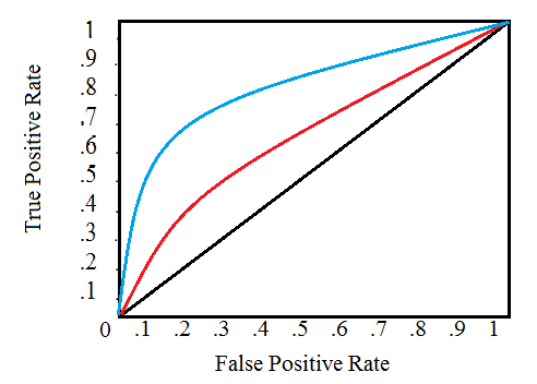
In layman’s terms, the closer the graph is to the top and left borders, the more accurate the model. If you’e familiar with calculus (specifically, areas under the curve), the ideal model has an area of 1; a random model (with a 50%) chance is shown with the black diagonal on the graph. Also shown on the above example; two models in blue and red. The blue line represents a more accurate model as it is closer to the top and left borders.
References
11 Important Model Evaluation Techniques Everyone Should Know
How to evaluate classification models for business analytics – Part 1